Logo Design
Goal & Description
The goal of this project was to make a logo for a real or imaginary client. The client I chose was “Mis Amis Bakery.” It was designed as a French bakery inspired by cafes in Paris. The goal of the business is to bring together family and friends. It sells baked desserts such as tea cakes, croissants, macaroons, tarts, etc. The target audience of the bakery is middle-class young adults/families, with easy-going and relaxed lifestyles.
Inspiration Images


Sketches


Final Design

Reflection
I am pretty satisfied with my final design. I feel that it reflects the business very well and has a good design concept. Elements including the light pink/green colors, the font, and the leaves all contribute to a soft, easy-going mood. This represents the tone of the company, which is a friendly, relaxed cafe. Additionally, the balance and circle shape makes for a cohesive logo.
An area I struggled with in my design was deciding which client to create a logo for. I wanted to find a company that I would be interested in and that related to me. I think the company I ended up choosing was very unique and entertaining to create a logo for.
Wallpaper Design
Goal & Description
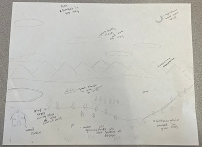
The goal of this project was to create a landscape wallpaper. My design was inspired by my family's cabin in Grand Lake CO. It shows the view of the lake from the cabin, and includes an image of the cabin in the bottom left. The title of the design is "Walden Ridge" to match the name of the actual cabin.
Inspiration Images


Sketch
Final Design

Reflection
I'm very satisfied with how this project turned out. I think it very accurately represents the view and cabin I was inspired by. I love each of the details, including the sailboat and wake, moon, stars, details on the cabin, etc. The color scheme fits very nicely together and I love the incorporation of the pink sunset. It's simple yet has many details that enhance overall design.
Era Poster
Goal & Description
The goal of this project was to create a poster portraying an era in time. I chose the 1920's, and wanted to incorporate themes of Jazz Age and Old Hollywood. I was inspired by the movie "La La Land" as I thought this movie could represent both themes. La La Land is also one of my favorite movies so I felt very passionate about making this poster.
Sketch & Inspiration Images


Final Design

Reflection
I really like this final design for many reasons, and I really liked the design process as well. I loved designing the poster because La La Land is one of my favorite movies, and I was very familiar with this iconic scene, as it is one of my favorite scenes as well, so I really enjoyed recreating it as my own design. There were some details that I struggled with, such as the light post and the city in the background, but I think I resolved them well and the design looks very cohesive. I also liked adding the Old Hollywood aspect, specifically with the font in the title, and the overall movie poster theme. I think the final design is unique and uses my own design styles but also strongly represents the actual movie (poster).
Ligature Logo
Goal & Description
The goal of this project was to create a logo that combined two or more letters into a single logo. I used my initials "S" and "I". I wanted to create a unique and realistic logo that stood out from others while also representing me, as it used my initials.
Sketch & Inspiration Images


Final Design

Reflection
I really like the final design. Its a very simple design but combines the letters in a creative way. It has a strong flow, and the shapes are very unique. I like how the gradient elevates the design, and represents me, because pink is my favorite color. I think it also looks like a logo, which is an aspect I really like. The S and I are easily Identifiable but also create they're own shape, much like other logos and brands do.